IELTS Academic Writing Task 1 Samples: Charts, Graphs & More
Last updated: Dec 30, 2025IELTS Academic Writing Task 1 is an essential part of the IELTS Writing section, where candidates are required to describe visual information like graphs, charts, tables, maps, or diagrams in their own words. Many students find this task challenging due to a lack of proper structure, vocabulary, or strategy.
In this blog, we will provide a complete guide to help you tackle IELTS Academic Writing Task 1 effectively. From understanding different question types like bar charts, pie charts, line graphs, tables, and process diagrams to analyzing high-scoring sample answers — this blog covers it all.

Table of Contents
What is the IELTS Academic Writing Task 1?
The IELTS academic writing task 1 is fully about writing the question summary in at least 150 words. Here, the questions are usually in the form of a graph, chart, or diagram. So, interpreting visual data and explaining information correctly is a vital skill that is required in Task 1 IELTS academic writing. So, you need several skills here, which are analyzing, putting ideas on paper, and many more. These skills are:
1. Writing an overview of the paragraph
2. Paraphrasing
3. Writing complex sentences
4. Data interpretation
5. Diagram and chart analysis
6. Structure organizing
7. Grammar and vocabulary
8. Spelling and punctuation
9. Coherence and cohesion
10. Comparing and contrasting
It is important to keep in mind that the academic writing task 1 IELTS is not an essay; you have to write a report for the data you see in the question.
Types of Questions in IELTS Writing Task 1 Academic
There are several types of questions in Task 1 IELTS Academic Writing. They are:
Here in the IELTS academic writing task 1, you have to describe some visual information in your own words. Moreover, remember that the minimum length of your answer must be at least 150 words. So, describe every single detail with a brief that you see in the graph, chart,t or diagram. Therefore, read below to go through the IELTS academic writing task 1 samples and understand the proper approach to answering the questions in the IELTS exam.
 Take Writing Mock Test Now!
IELTS Academic Writing Task 1 Samples
In this section, you will get to know about the IELTS academic writing task 1 questions, with their sample to help you prepare for the same. Moreover, there are 3 samples given with each type of question. So, read them with focus so that you don’t make any mistakes during the IELTS exam.
IELTS Writing Task 1: Bar Chart
The bar chart is one of the most common and important types of questions in the Task 1 IELTS writing section. Therefore, you will find three samples below that will help you understand the IELTS format and score well on the exam.
Bar Chart Sample 1
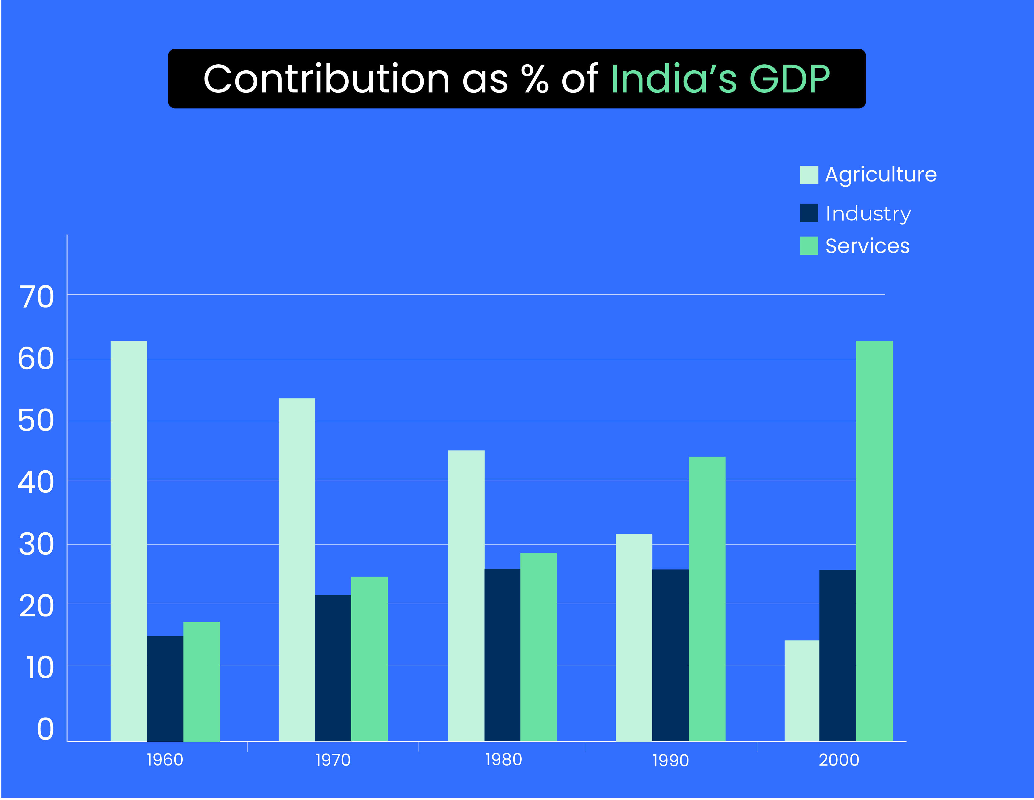
IELTS Writing Task 1: Sector Contributions to India’s GDP from 1960 to 2000
Bar Chart Sample 2
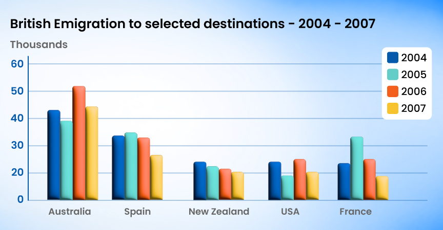
IELTS Writing Task 1: British Emigration to selected destinations between 2004 and 2007
Bar Chart Sample 3
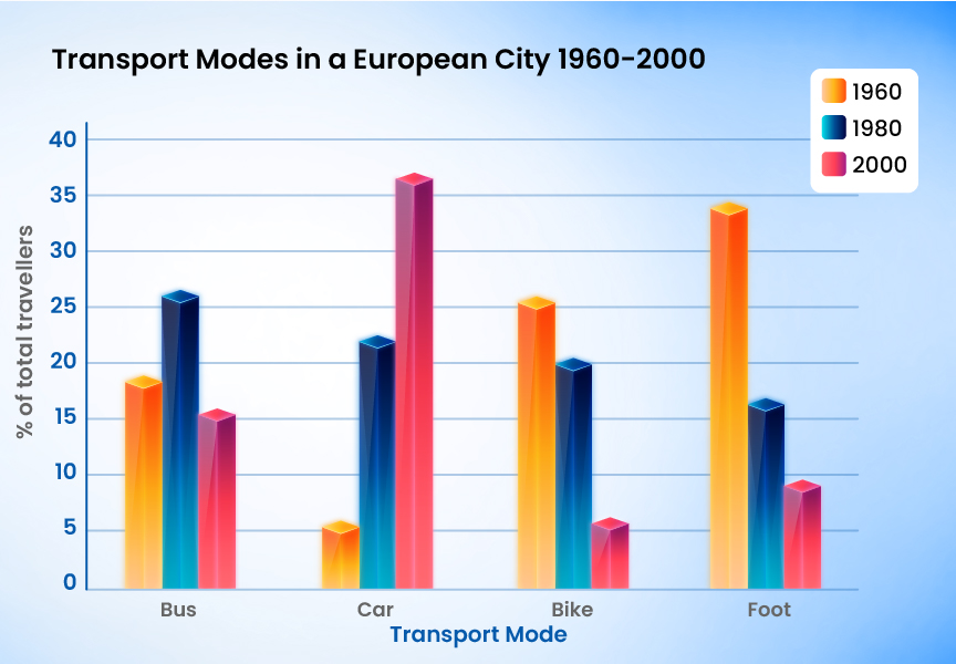
Task 1 IELTS Writing: Transport Modes in European City 1960, 1980, and 2000
Download Sample Answers PDF for Bar Graph Now!
IELTS Writing Task 1: Line Graph
A line graph is again an important IELTS academic writing task 1 question. This is somehow similar to the bar chart, but the data is depicted by joining the lines between each piece of information. To know more about the same, go through the samples below and understand the correct way of approaching.
Line Graph Sample 1
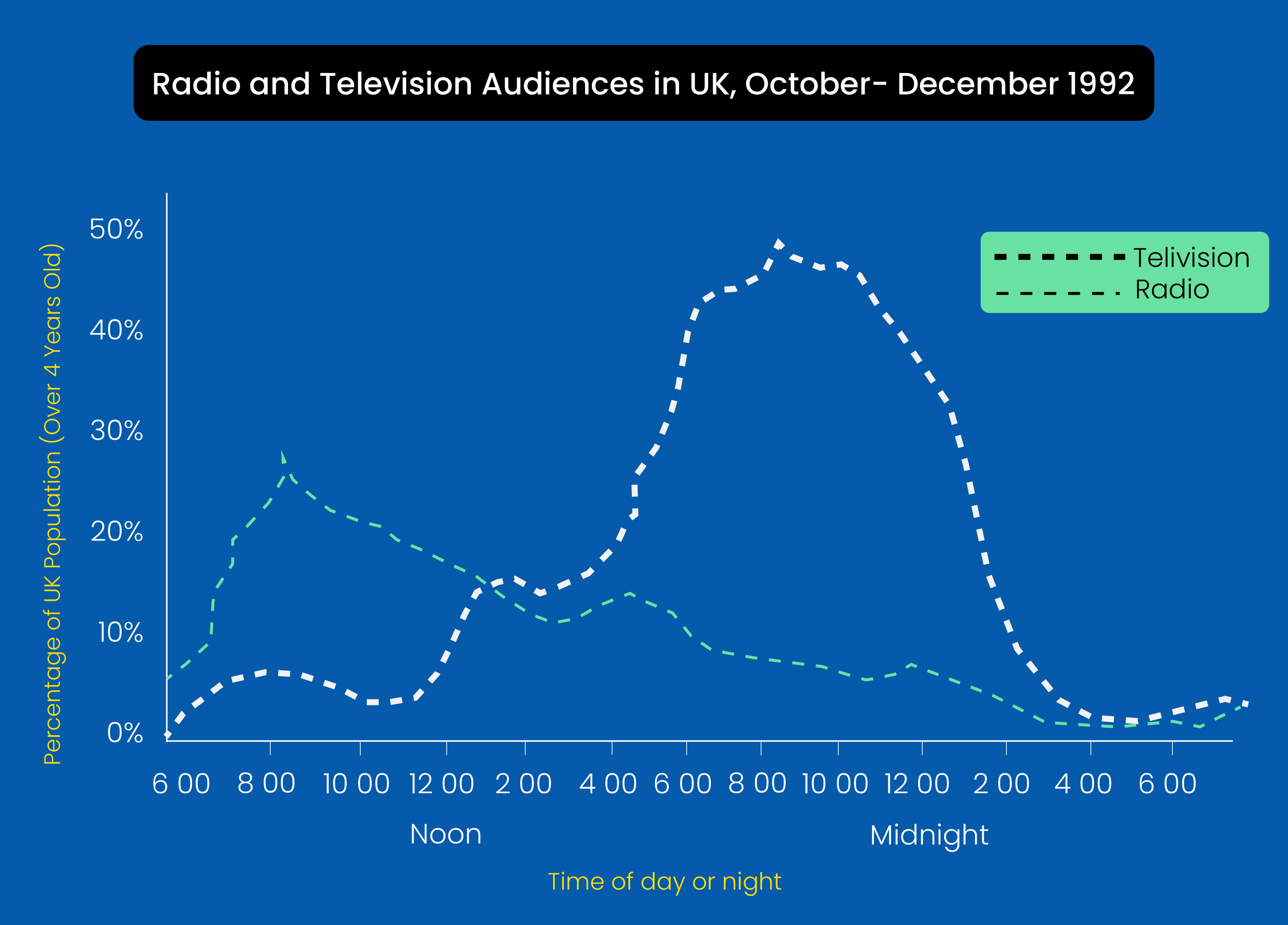
Writing Task 1 Academic: Radio and Television Audiences Throughout the Day in 1992
Line Graph Sample 2
Writing Task 1 Academic: Selected Countries of Residence of Visitor Arrivals for Education

Line Graph Sample 3
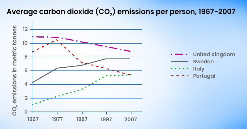
Writing Task 1 IELTS: Average CO2 Emission Per Person 1967-2007
Download Sample Answers PDF for Line Graph Now!
IELTS Writing Task 1: Table
The next type of question in task 1 IELTS academic writing is a table. Here, you will go through tabular data and have to analyze that data to write a report on the same. Thus, go through the samples below and understand how to appear for these questions with accuracy.
Table Sample 1
IELTS Writing Task 1: Distribution of the World Population in 1950 and 2000

Table Sample 2
IELTS Writing Task 1: Secondary School Attendance
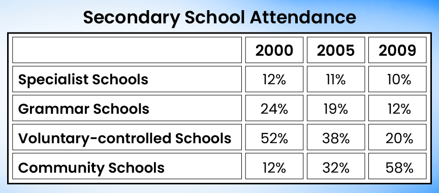
Table Sample 3
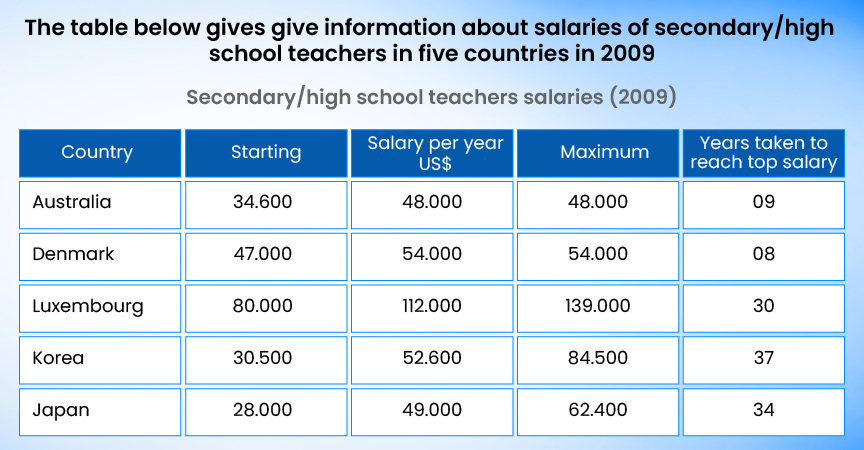
Writing Task 1 Academic: High School/Secondary School Teacher Salaries
Download the Sample Answers PDF for the Table Now!
IELTS Writing Task 1: Pie Chart
The pie chart is again a common type of IELTS academic writing task 1 question. Here, you have to analyze the data given in a circular diagram called a pie chart. Thus, go through the 3 samples given below and understand the accurate way of solving this question.
Pie Chart Sample 1
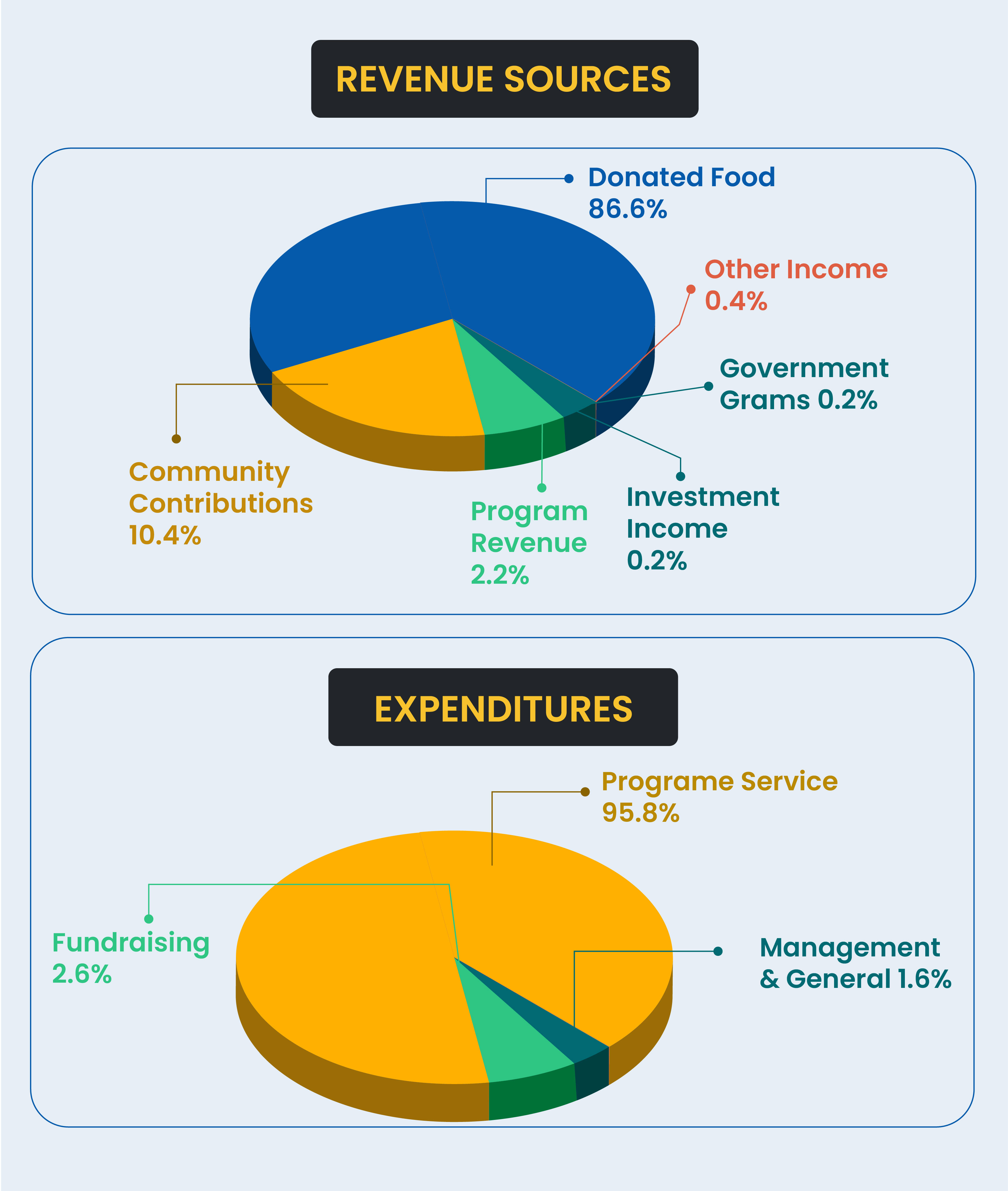
Task 1 IELTS Academic Writing: Amount of Revenue and Expenditures in 2016
Pie Chart Sample 2
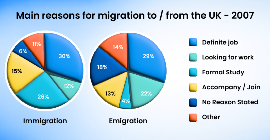
Task 1 IELTS Academic Writing: UK Immigration and Emigration
Pie Chart Sample 3
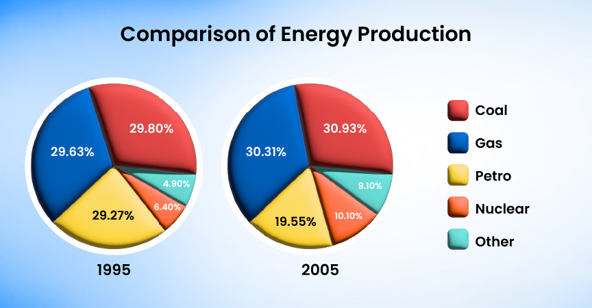
IELTS Writing Task 1: Comparison of Energy Production
Download Sample Answers PDF for Pie Chart Now!
IELTS Writing Task 1: Process Diagram
PA processdiagram is a kind of question in IELTS academic writing task 1 that seems difficult to the candidates, but if understood well, it is among the easiest types. So, go through the samples below and practice well for this type.
Process Diagram Sample 1
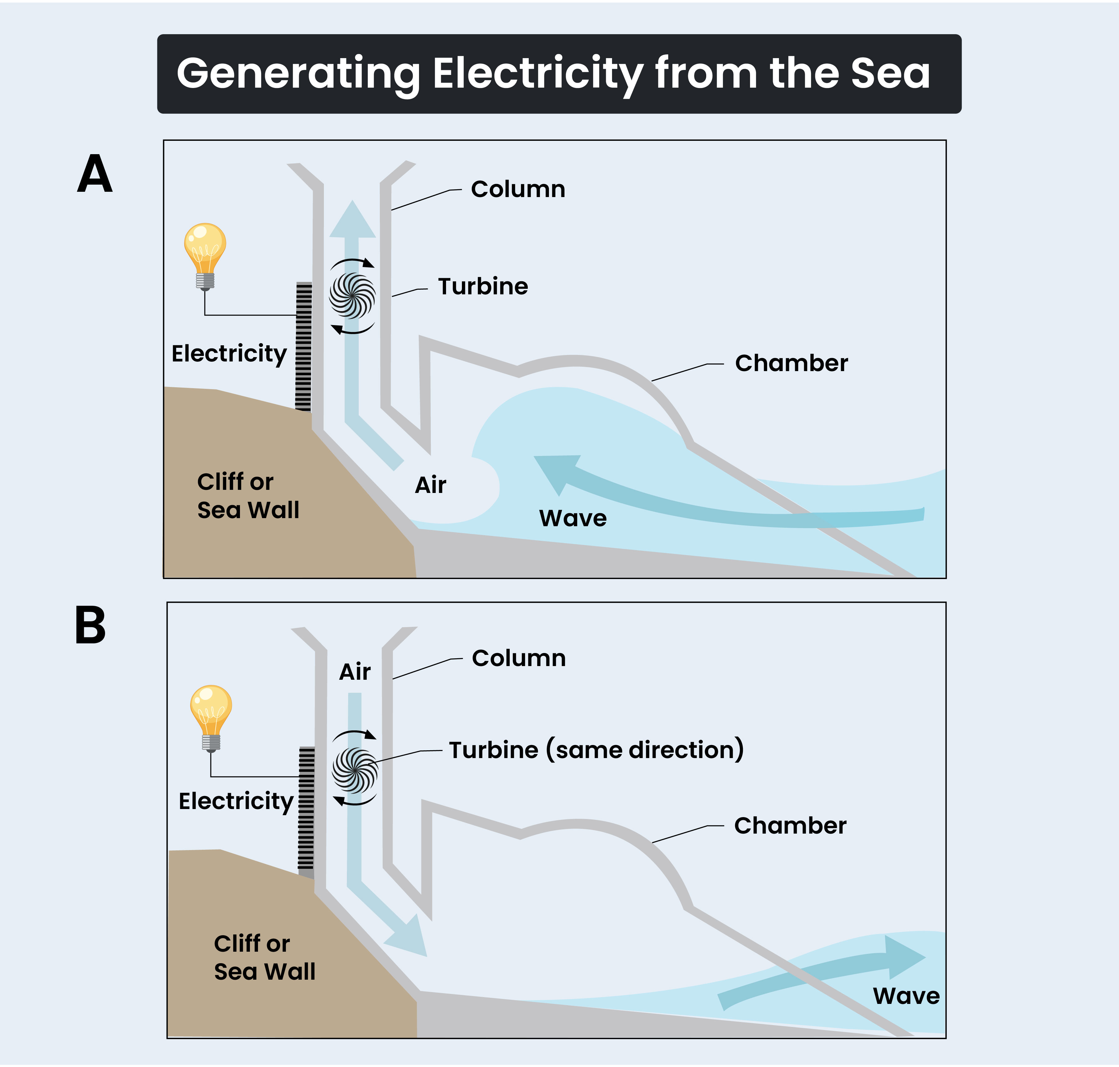
Task 1 IELTS Writing: Generate Electricity from Wave Power
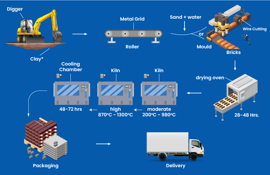
Process Diagram Sample 2
Task 1 IELTS Writing: The Brick Manufacturing Process
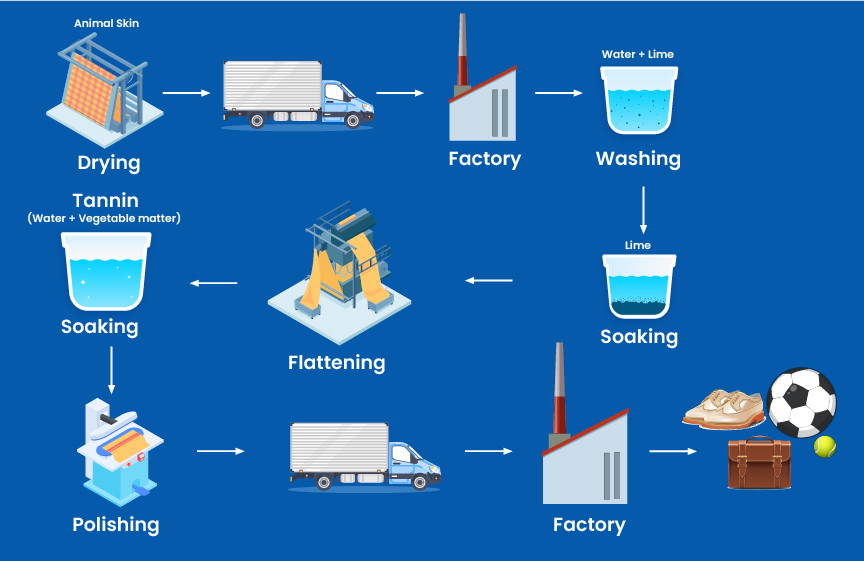
Process Diagram Sample 3
IELTS Writing Task 1: Leather Process
Download Sample Answers PDF for Process Diagram Now!
IELTS Writing Task 1: Map Description
Map description is one of the very important questions of task 1 IELTS academic writing. Here, you must pay complete focus to solve it properly. Thus, go through the samples below and check the correct way of answering these questions.
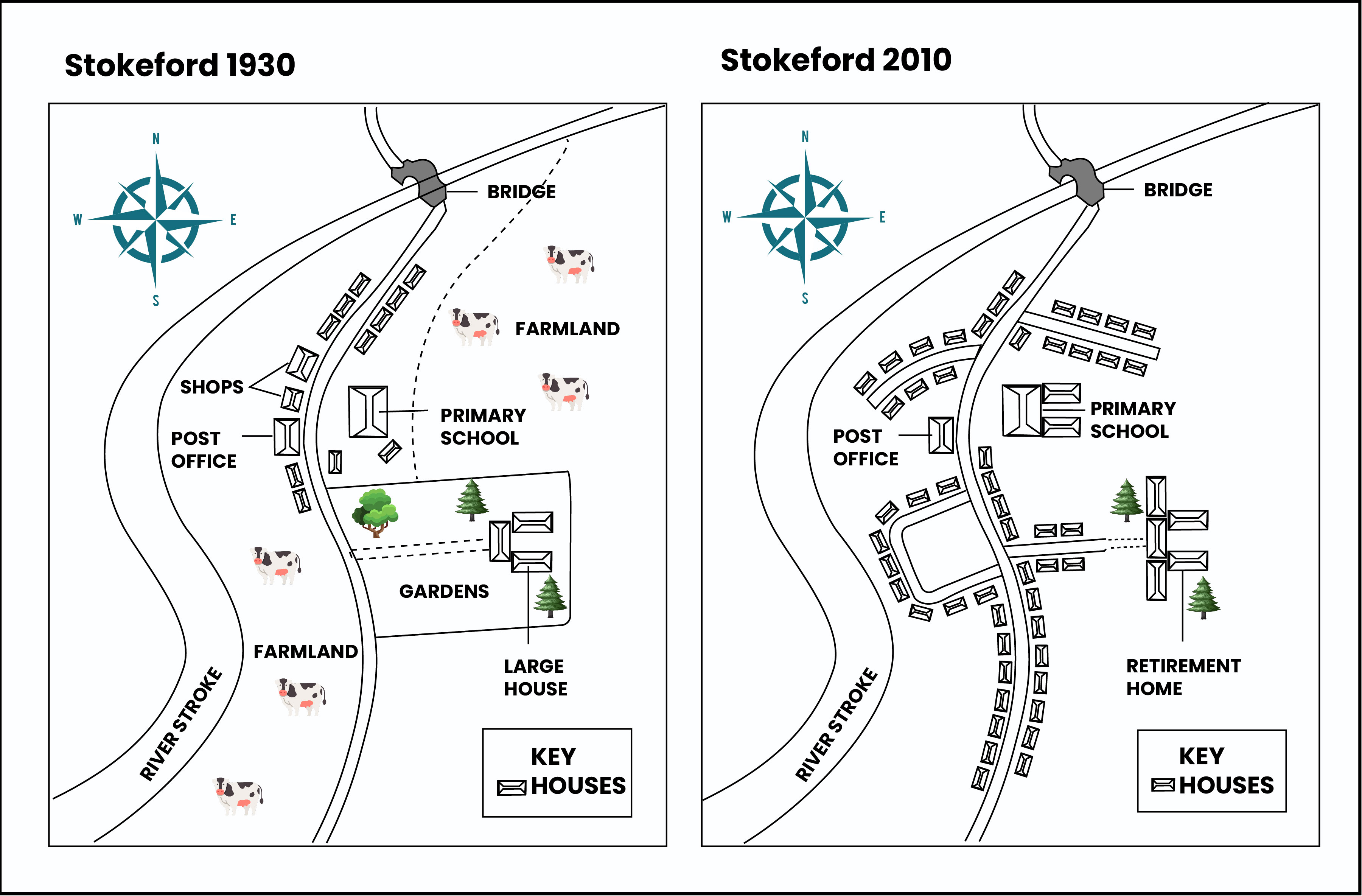
Map Description Sample 1
Task 1 Writing IELTS: Village of Stokeford in 1930 and 2010
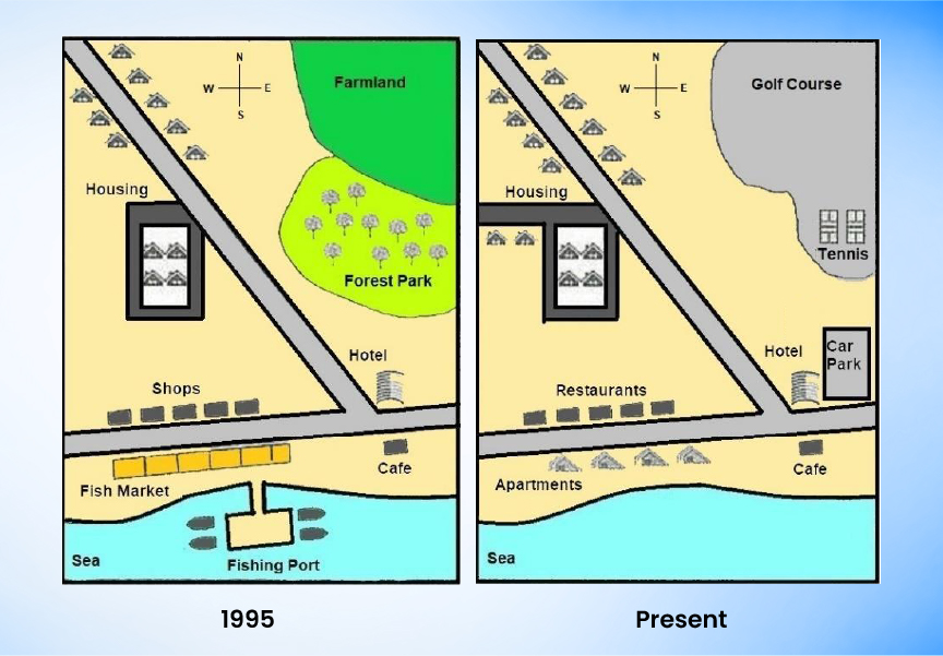
Map Description Sample 2
Task 1 Writing IELTS: Development of the Village of Ryemouth
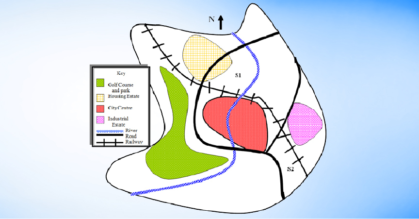
Map Description Sample 3
Writing Task 1 IELTS: Proposed Sites for a Shopping Mall
Download Sample Answers PDF for Map Description Now!
IELTS Writing Task 1: Mixed Data
The mixed data types of questions in IELTS academic writing task 1 are common nowadays, becoming an important type for the candidates. Here, you get more than 1 data, for example, a pie chart and a line graph together. Or, a bar chart and a table together. Therefore, this may sound tricky, but getting help from the samples below will help you ace them.
Mixed Data Sample 1
Task 1 Writing IELTS: Attendance at Adult Education Centre

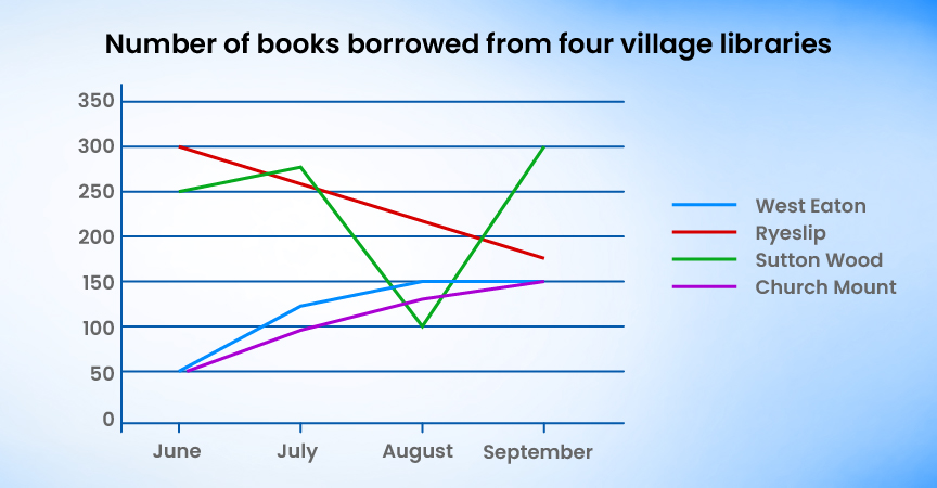
Mixed Data Sample 2
IELTS Writing Task 1: Books Borrowed from Four Village Libraries
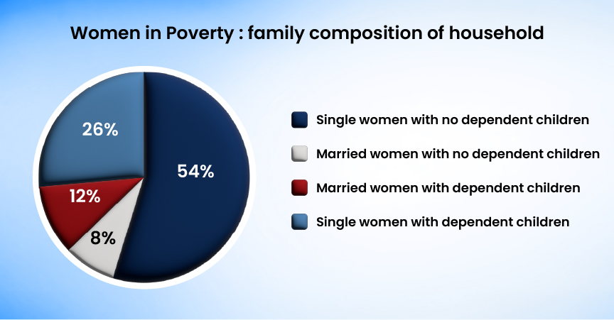
Mixed Data Sample 3
IELTS Writing Task 1: Women in Poverty- Family Composition of Household
Download Sample Answers PDF for Mixed Data Now!
Tips to Excel in IELTS Academic Writing Task 1
Students must follow some IELTS preparation tips to master the IELTS Academic Writing Task 1. So, given below are some top tips to frame your answers for IELTS task 1 of the writing section.
- Read the instructions carefully and pick out the main features and trends from the data.
- Take a few minutes to organize your ideas before you begin writing your answer.
- Do not simply copy the words from the paragraph. Learn vocabulary for IELTS so that you can paraphrase the information.
- Use linking words such as “while”, “in addition”, and “on the other hand” that can help you connect your ideas more logically.
- Give attention to the most important information rather than including irrelevant details that are not required.
- Assign sufficient time for each task and aim to completethe academic writing task 1 within 20 minutes.
- Using the correct pronunciation in the right places is most important. It can help you showcase your fluency in English.
- Take a mock test for IELTS task 1 of the writing section, as it will give you an idea of where you are lacking.
Conclusion
This was all about the IELTS academic writing task 1. Here, this blog has made it very clear what you have to do in the task and also different types of questions in the same. Moreover, it is recommended that you go through every single sample in this blog to get a detailed explanation of each possible task in your IELTS exam. Thus, prepare well for the exam and improve your total band score to get admission to your dream institution overseas.
0 comments

Practice Makes a Man Perfect!Take FREE ielts Mock Tests
Start FREE Mock Test


Get Unlimited Access with
IELTS Prep Boost
Mock Tests
Practice Questions
Study Material
Recorded Classes
What is your Target IELTS Band?


Get familiar with the Real IELTS Exam for Free!
Start Free Mock Test